Many people think of graphic design as making things look pretty, but it is far more than that, and is an important aspect of anything that someone has to look at to use.
So, what is graphic design? For our purposes here, think of it this way: if game design is controlling how people experience a game, graphic design is controlling how people experience visual information.
This is pretty broad, and covers a lot of things about what players see when they look at your game’s components. If you don’t have a lot of experience with graphic design, it can be easy to get overwhelmed by the task of “graphic design”. Hopefully this article will be able to break it down so that you can figure out what you should focus on at various stages of development. But first, let’s look at some specifics of how you might want to control the visual experience.
WHAT TO DESIGN
HIERARCHY OF INFORMATION. WHAT’S MOST IMPORTANT?
If your game has any depth beyond, for example, Uno, you probably have multiple layers of information. You want players looking at the right information at the right time. The most frequently used values or words should be the most prominent: use the biggest letters, the boldest font, with the biggest contrast between it and the things around it. Maybe this is the monetary value of a card, or the point value of a tile.
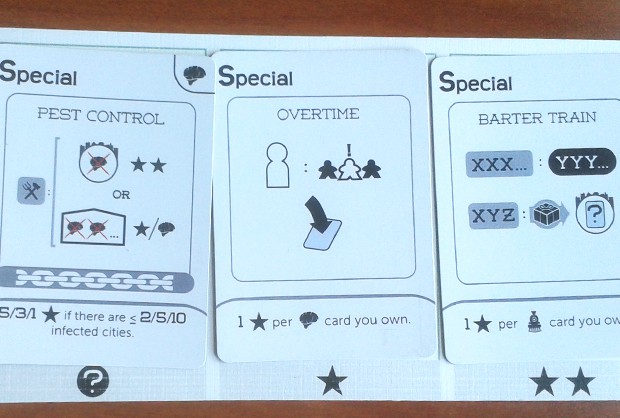
Brains Grains & Trains cards have separate, intuitive areas for title of the card, card power, and end-game bonus
Secondary information (trade-in value, faction name, element type, etc) would be smaller and either underneath the more important information, or in a different corner. Flavor information like names might be likewise understated, unless it’s referred to by name by other text in the game (then you want players to be able to find it easily).
FOCUS A PLAYER’S ATTENTION ON A SPECIFIC AREA OR VISUAL PATH.
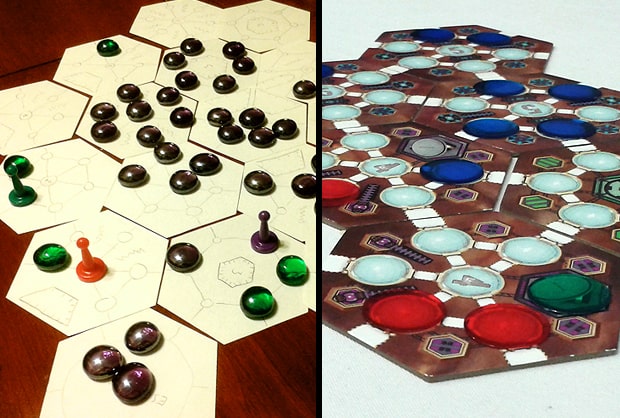
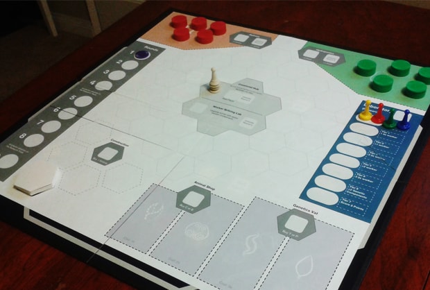
Technically, this still deals with hierarchy, but not all information is numbers or text. If your game has a spatial element like a map or worker locations, positional information can be very important. Players need to be able to tell at a glance how different areas connect. Spaces for physical components like workers or resource tokens need to be clear. These spatial elements need to be similarly highlighted in order of importance and frequency in which players interact with them.
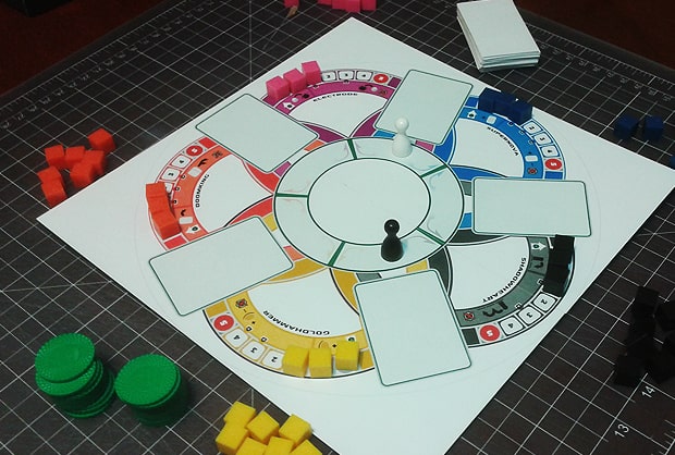
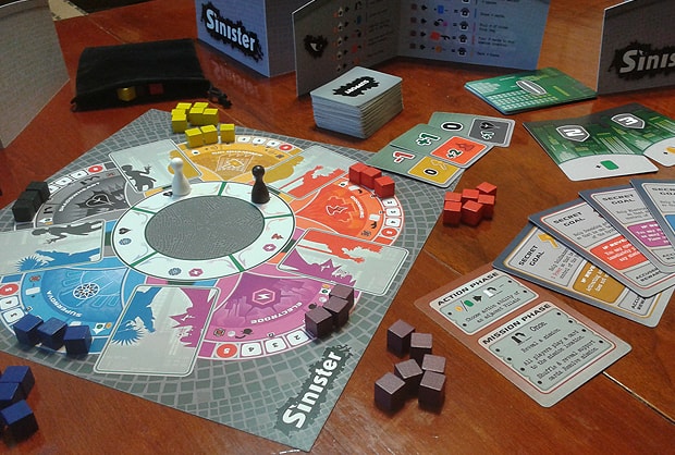
When developing Sinister‘s five-sectioned board, placement of power cubes and positioning of the rondel were key in showing what happens at each point of the game.
SETTING THE TONE.
A game’s tone is just as much a part of the experience as the choices players have to make. Munchkin would be a very different game if it used gritty, realistic illustrations instead of cartoony ones. But, it’s important to note that even with no illustrations, you’d be able to understand the tone of Munchkin from other choices its developers made. Names of things can clue players in to how serious or how silly they should expect things to be. Font choices likewise can reflect a level of formality or give a historical context. Even if your card backgrounds are just a flat color, bright pastels will create different expectations than dark, desaturated colors.
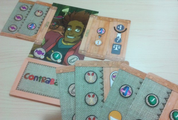
Contraband‘s fun tone are present in not only the icons, but in the font on the back of the cards and image choices.
ESTABLISHING A VISUAL LANGUAGE.
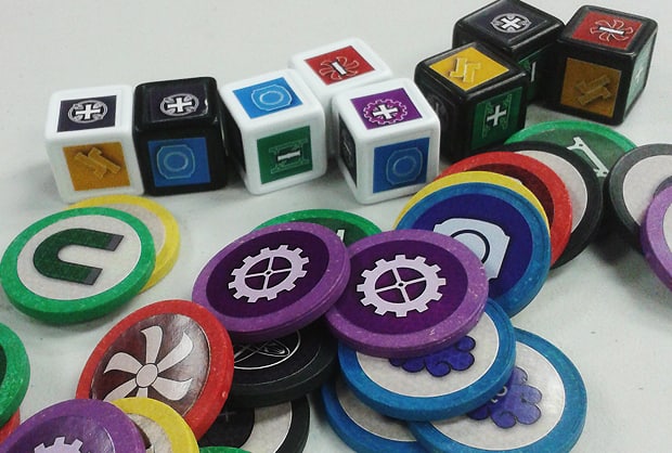
A consistent set of symbols can make gameplay elements easier to parse, particularly if players are going to need to understand things that aren’t directly in front of them. Symbols can be immediately recognized across the table, while text may require players to spend a few moments trying to read (or reread) to understand.
WHEN TO DESIGN
EARLY PROTOTYPE
The main concern you want to worry about with an early prototype is removing ambiguity of information. Make sure you are able to test exactly the parts of the game you are iterating on without having to worry about component quality getting in the way. You also want to make sure you are able to iterate quickly, so if it’s easier to make something that looks really rough but can be produced quickly, don’t worry about having nice graphics.
ATTRACTING PLAYTESTERS
After your game has a solid enough form that you’re not changing the rules after every playtest, you probably want to start bringing it to a broader audience. If this includes meetups, conventions, and other boardgaming events, then at this point you do want your prototype to be as interesting as possible to look at so that potential players passing by can be convinced to stop and give you their time. Fortunately, even if you aren’t an illustrator, “interesting” does not mean it has to have a lot of art. Clean lines, bold colors, and a solid hierarchy of information can still show that your game will provide a compelling experience.
![]()
Simple printed cards in sleeves helped attract playtesters for Beacon.
SENDING IT ABROAD
Usually blind testing is something you do later in a game’s development, but at whatever point you decide to send your game into the wild without you there to guide it, this is where you really want to make sure that the visual design is as intuitive and unambiguous as possible. This is doubly true if you are leaving your prototype with a publisher or reviewer. It helps to have illustrations, but again it’s not required. However, if you have any doubts about the visual quality of your game, this is the point where you really might want to consider seeking out a professional for help.