Your game’s packaging may not matter too much in online sales or Kickstarter, but if you want to distribute to game stores, you need to be smart about it. It makes sense: Your box’s the first thing people see in a game store, and possibly the only thing they’ll look at to learn what your game is about before they buy it.
At the GAMA Trade Show 2014 in March, Jessica Blair from Roll to Market shared tips on the anatomy of a good game package design: what makes people pick it up, what compels them to buy, and blunders even big companies don’t consider sometimes:
DESIGNING YOUR BOX
- Good cover art is essential. Get a good illustrator and really make it shine so that people want to pick it up and turn it over for more information!
- Have a big title treatment and snappy tagline and name of the designer, but don’t include much more text than this. The job of the front is not to completely explain the game, but to get your customers curious about what’s inside and pull it off the shelf.
- Number of players, age range, and time to play icons are standard on all good box designs, but if they detract from the art too much, they can go on the sides.
- If you have a game with cool or unusual components, consider a window to show them off. Sometimes, people will just buy a game for the shiny bits alone, and planning a window can be as little as 3 cents extra per box.
- The name of the game should be on all panels, so the game store owner can arrange it in a way that fits best on his shelves.
- Number of players, age range, and time to play icons are good for the side panels, too.
- Keep it simple, uncluttered, and easy to read in a bookended-lineup.
- Show all the pieces of your game in action so that a person can explain how to play it from the back of the box.
- Explain your game in concise language that’s fun and hits your key selling points. Avoid big blocks of text by breaking it up into bullets.
- If you’re talking about a player’s actions, phrase it in the second-person (“You are a zombie-killing farmer”) rather than third-person (“Players are zombie-killing farmers”) for a more powerful experience
- Format your UPC code properly! Some larger retailers have specific guidelines for your UPC format.
- If you have translations for your game and want to reach out to multiple languages, don’t try to squeeze them all onto the box! Put them on a website and create a QR code for the translations, then put flag icons next to it for the appropriate countries.
- That said, be careful with QR codes. They’re great for demo videos and other explanations, but retailers can get angry if it directs you to a cheaper place to buy the game online. So add a bit of text to tell folks where the QR code leads!
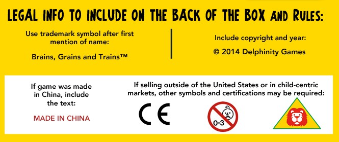
LEGAL SYMBOLS

Note: This is not legal advice. ALWAYS check with your manufacturer and/or legal professionals to ensure your game complies with the proper standards before including symbols on your box design.
Usage info about the CE Marking
PLANNING YOUR BOX
So you’ve got a great handle on how to design your box, but what size should you use? Plan your box carefully to optimize where it’s placed and how it’s sold:
- Plan the depth of your game box carefully! Boxes that are too thin or tall will faceplant off the shelves, making for a bad buying experience.
- Size your game box to a similar size as other games that fit within your theme, because guess what? Retailers like to shelve similar-sized things together to economize space! If your game is a party game, a big square Apples-to-Apples box might work great, but if your game is a 4-hour strategy game, you might want to go more Battlestar Galactica size.
- Retailers expressed a strong dislike for small tuck boxes for a few reasons reasons: The only place they typically have in their stores for tuck boxes is with their standard playing cards, so you’re forcing the store owner to put it together with games it might not be similar to. Also, smaller boxes are easy to shoplift in a coat pocket. Consider a Munchkin-sized box or larger for card games.
- Shrink wrap seams are placed along the edges by default, but if you ask for the seam to be 1mm above the bottom edge of the box, it can help prevent box faceplanting without ruining the look.
Having a smartly-designed box can mean big sales, and it’s worth it to learn how it’s done and look around at how other companies handle it. What game packaging has caught your eye in your last visit to your local game store?


