This post first appeared on Seth’s blog, Cumbersome
I learned a word a few years ago from a friend of mine — a word that I don’t use nearly enough. Not that it’s a common word that would come up in conversation very often, it’s actually a fairly obscure word that a lot of people probably haven’t heard. But there’s at least 1 context in which I think I will start to use it more often.
And the word is (drum roll please)…

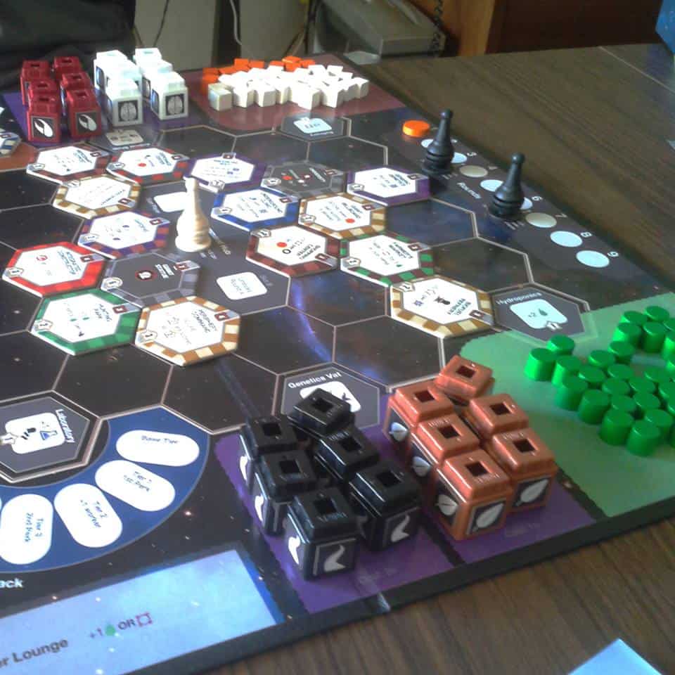
The context in which I intend to use the word subitize more is iconography. I’m currently working on a game for Tasty Minstrel Games called Chimera Station, by League of Gamemakers member Mark Major. In Chimera Station, you employ a team of alien workers to build a space station, and in order to make your workers better at various jobs you splice brains, claws, leaves, and tentacles onto them. As you build the station you’ll be adding numerous modules to the board, each one representing a new worker placement space:

I’ve been working with graphic designer Daniel Solis, trying to express a lot of information onto these small tiles, with a little room for background art where possible. If you’ve played a game that has tiles like these then you probably know what I mean… there’s a lot to convey, and a few different ways to try it:
- Some games try to go language independent, replacing all English text with icons. This can lead to an overwhelming amount of hieroglyphics if the effects to be iconized are too complicated or varied.
- Some games forego icons altogether and just use English text to convey all the information. The problem here is that text takes up a lot of space, especially if it’s specific and thorough. Trying to abbreviate text to take up less space can be harder to read than the over-iconizing mentioned above!
- Some games use a combination of text and in-line icons, which is what we decided to do for Chimera Station. On the down side it’s not language independent… but on the up side, it offers the best chance at fitting the necessary info best and most clearly.
It’s that third option I’d like to talk about today. The first pass of the modules with in-line icons (see left images below) did manage to reduce the text, making the tiles more readable. However, the text is small, the space is compact, and most players will not even be reading it face up… so I asked Daniel to show multiple icons rather than a number followed by an icon ([coin][coin] rather than 2[coin]):
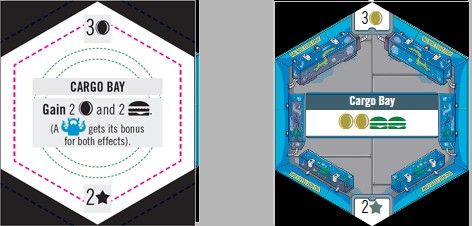
The parenthetical clarification was removed from the tile – it will be included in the rulebook. The right image shows a sample background, not the right one for this module.
The new format looked great on tiles that only had 2 or three icons on them, but it introduced a different problem on modules with more icons on them. For example, Cryogenics allows you to trade a genetic component in for 6 coins…
Six coin icons is probably easier to read upside down from across the table. The cost (top) and VP value (bottom) on this tile got adjusted, but that’s not relevant to this discussion.
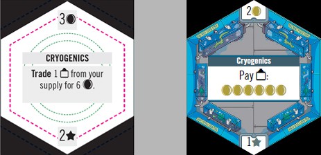
While I do think the version with 6 icons looks better than the original version, it’s difficult to tell at a glance exactly how many coins you get. Which brings me to the whole point of this article… subitizing.
The definition above indicates that humans are limited to being able to subitize about 7 items, but a more common or practical limit is more like 4 or 5 items. If you see fewer than 5 items, you can immediately know how many items there are without having to count them one by one. That’s called Perceptional Subitizing.
It could be that the 6 coin icons are too many for players to comfortably subitize, but I wasn’t happy with the idea of going back to the original text version either. So I tried a simple tweak: I added a gap in the middle of the row of coin icons, separating the 6 items into two sets of 3 icons.
Three items are easy enough for anyone to subitize, so breaking the coin icons up in to two sets will allow players to fairly easily combine 3+3 and identify 6 icons. This is called Conceptual Subitizing:
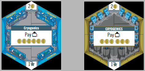
It’s much easier to identify “6 coins” in the right image than the left one, isn’t it? The tile also looks a lot better with the correct background 🙂
There are only a couple of tiles in Chimera Station that have more than 5 icons on them, and for those I’m hopeful this format will work out.
—
SO, WHAT DO YOU THINK?

