WARNING: What you’re about to see is a blog post crammed full of pictures. Your eyes will be assaulted with gorgeous game shots.
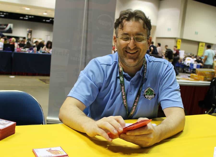
This is how I found Scott King…
I think this captures Dead of Winter well. It’s something about putting the camera on eye level to really capture the zombies coming at the viewer, and being surrounded. The components are coming in from out of frame, confining the space.
I appreciate snapping game pics too, and have gotten more into it since this blog started. Case in point, I spent an afternoon at my local game cafe (thanks Gamehaus!) to grab some shots used in Tom Jolly’s piece on Artificial Intelligence in Board Games.
Knowing however that my own photos could only take my word game so far, I sought Scott King out when it was time to take high quality shots of Letter Tycoon. Before I show you those, I first asked Scott if I can share some of his other game photos as well, with my assessment of what makes them work.
CARCASSONNE
DEPTH OF FIELD FOCUS HELPS TELL ORIENT YOUR VIEWER, GIVES CONTRAST.
PIECES IN ACTION GAME PIECES “IN PLAY” HELP BRING A VIEWER INTO THE WORLD.
FILLING THE FRAME VS OPEN SIDES – COMPARE CARCASSONNE ABOVE CAPTURING THE EXPANSE OF TILE PLACEMENT VS COLT EXPRESS BELOW, CAPTURING A “MINI” SET.
COLT EXPRESS
LAYOUT AND COMPOSITION – COMPONENTS DON’T BLOCK EACH OTHER (UNLESS INTENTIONALLY), ARE SPACED OUT JUST SO AND FOLLOW A RULE OF THIRDS TO DRAW YOUR EYES ACROSS THE PIECES.
THREE SIDES ARE ‘OPEN’. THE TRAIN BREAKS THE FRAME EXTENDING IT INTO THE DISTANCE.
RED 7
BACKGROUND CHOICE – RED 7, BELOW, SEEMS TO POP ON A LIGHT TEXTURED BG, ADDING DEPTH. COMPARE THIS TO THE DARK BACKGROUND FOR COLT EXPRESS.
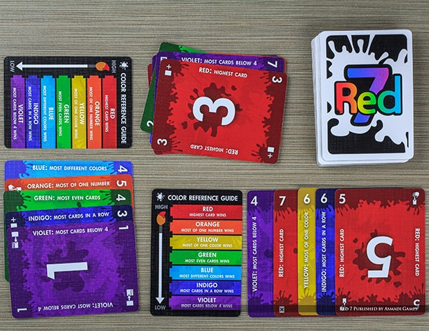
COMPREHENSIVE COMPONENTS – CARD GAMES ARE HARD TO MAKE SEXY. WHEN IN DOUBT, SHOW HOW MANY CARDS THERE ARE.
CTHULHU DICE
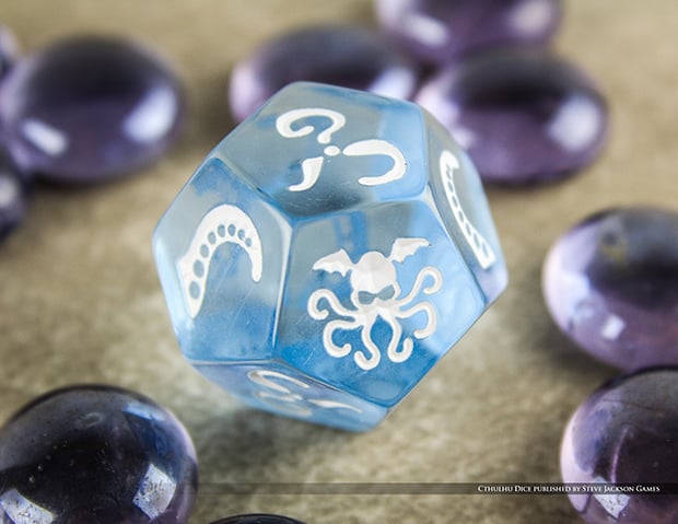
MACRO LENS – YOU NEED TO GET CLOSE SOMETIMES.
CONTRAST THAT WITH THE DISTANCE YOU NEED TO CAPTURE THE WHOLE TOWER BELOW
ANIMAL UPON ANIMAL
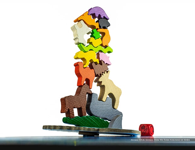
CAMERA ANGLE – CONSIDER WHAT ANGLE IS MOST FLATTERING FOR THE GAME MECHANICS AND THEME. COMPARE THIS WITH THE OVERHEAD ANGLE OF RED 7 – YET BOTH CAPTURE HOW YOU INTERACT WITH THE GAME.
If you want to see Scott talk more on how to set up a shot, he recently filled in on Tiffany Ralph (TheOneTAR)’s channel, teaching game photography. He covers a basic way to start getting better photos even using your cell phone camera.
—
And now, without further ado, Letter Tycoon as captured by Scott King.
These photos should be available on BoardGameGeek soon (was hoping they’d make it for the article. I will update each photo to click to BGG). If you dig these photos and support Scott’s work, we can use your thumbs! Thank you!
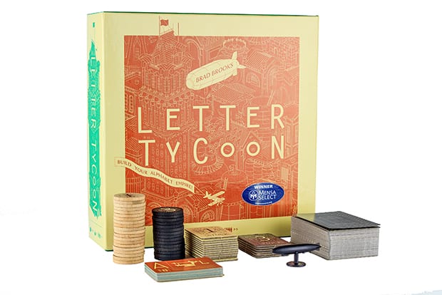
Traditional box shot. The components are well framed and it reminds me of a city skyline.
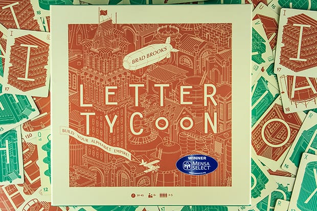
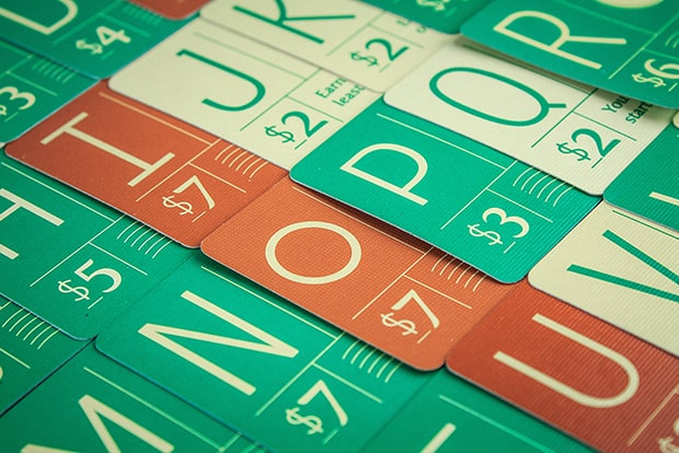
A totally different way to see the same box. I want to get lost in an alphabet empire!
Every tycoon needs a zeppelin. Up close, it dominates the frame.

Up close and personal on Letter patents, reinforcing the alphabetical collection.
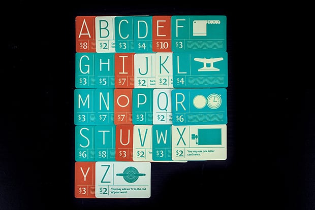
The same patents, but compacted and surrounded by empty space. Works for a complete view of a component.
The custom tray for the game, sitting on components which extends the boundaries.
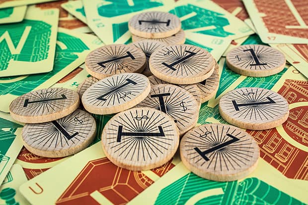
An abundance of coins and a wealth of word play awaits you in Letter Tycoon!
SCOTT KING ON KICKSTARTER
Last but not least, I want to mention that Scott has a Kickstarter for his 2016 calendar. (He modestly didn’t tell me, I just found it out! It’s until July 24…) Apparently, the calendar will be available post campaign, but this is the only chance to order a custom version of the calendar where YOU choose the pictures for each month!
Hey, tell him you want a Letter Tycoon picture!

