Does your latest design resemble flavorless tofu cubes, ready to mix with a flavor? Are the mechanics straight from a can, with a generic label? This will hopefully prove a delicious counter-post to Luke Laurie’s article, “Mechanics are more more important than theme”. If you can’t tell, I’m arguing the “TASTE’S GREAT!” to his “LESS FILLING!” in this debate. I’ll take a look at why designers should take a theme-first approach to designing games.
“THEME, IT’S WHAT’S FOR DINNER!”
Oh no, what am I saying?? Is theme bad for you? Yes, it is the dark side. It’s pure temptation. It’s of the devil, I say! Embrace it – and design the best games ever made! Yes, theme is fattening. It’s going to rot your teeth. But you only live once, right? Theme is going to bring people to the table! If the number of calories in this post were a fraction of the dollars that theme-driven games are going to sell this year, why it would be as Egon Spengler once described, “a twinkie 35 feet long and weighing approximately 600 pounds.” That’s a big twinkie!
There’s a lot of ground to cover, so let’s get a couple of caveats out of the way:
No RPGs? To make this a fair fight, let’s put down the DM screen. No mechanics stand a chance in the light of glorious, story-driven, thematic role play. But we’ll keep in mind RPGs in the context of what lessons they can offer board game designers for story. Warrior image above courtesy of Ignacio Krichman, links to his DeviantArt and FB pages.
The chicken and the egg. We all know that there’s no actual winning side here. It’s an endless debate, and that’s fine. I’m just taking a extreme theme position for fun, even though I actually believe in a balanced meal.
Design vs market. We just eluded to “theme sells” above, but as Randy Hoyt pointed out in the comments on Luke’s article, there is a big difference in these two sentences:
A) Theme or mechanics is more important for the designer to focus on.
B) Theme or mechanics is most important in a finished game.
What I’m going to do is focus on “A” and take market out of this. It means I’m going to give up talking about how Magic or mini figs are keeping FLGS alive, but I’m doing this to refute the ground that Luke raises on “publishers may change your theme.” This is actually irrelevant to the design process.
Theme may change, mechanics could break down, you could just as easily argue that working in certain themes guarantees you that publisher meeting! After all, “You Can’t Over-Use a Good Theme!” There are companies that are theme focused (Plaid Hat, Twilight Creations, Flying Frog, etc) and you could pitch to them or you might be self-publishing for all we know.
And by the time you’re on a shelf, it’s in the hands of each unique customer to decide what they want. The only thing we can do is design the best game we can, and the best blend of theme and mechanics. But what should you start with? Theme, of course! But why?
THEMATIC CONSONANCE = STRONGER GAME
I turned to Seth Jaffee, Lead Designer at Tasty Minstrel Games, for an example of a design that had come to TMG that he felt had benefitted from theme-first design. He did me one better, he pointed me to a blog he wrote on this topic, “Theme first vs. Mechanics first Design”.
At the end of his blog post he captures it perfectly with the words, “thematic consonance.” You have a better chance at harmony among your theme and mechanics, if you start with theme.
THE CURIOUS CASE OF UWE ROSENBERG
I never thought I’d use the designer of Agricola in a debate for theme-first, but in fact he has cited (on his blog, and in an interview) that he designed Agricola, the #3 ranked board game on BoardGameGeek, with theme in mind as a starting point.
There you have it folks. Grand stories at the core. Now, I don’t believe Uwe conveyed the deeper ‘story-telling’ in Agricola. You can get a small taste in the occupation flavor, but I think Dungeon’s and Dragons has a bit of edge here in character backstory. I think Uwe primarily made a worker placement game that redefined the mechanic. But perhaps the success of this innovation with the mechanic is because he first tied it directly to a theme. People can say that farming is still boring, but it’s the #1 game about farming for better or worse.
MECHANICS ARE PLUG AND PLAY, THEME IS THE POWER SOURCE
A great quote in Luke’s article that I completely agree with is “Each element should have a mechanical purpose and function. It shouldn’t be included solely because the theme demands it.” Absolutely. In the comments, Norv Brooks brought up a great counter statement, which is, “It shouldn’t be included solely because it’s a cool mechanic.”
Sure, you can design with a mechanic in mind. Go over to Boardgamegeek and check out their list of game mechanics. Pick one and begin. Actually, you should pick two, in order to keep it interesting. How about area control and memory? (actually, this has been done very successfully). A lot of fun games come from the mechanics that are jotted down in a designer notebook but don’t fit in your current game. That’s fine, but I think this means you are looking for the right theme and experience to pair them with.
Don’t be afraid to change mechanics to make the right game. Brad Brooks wrote an informative example, “Transmogrify Your Mechanics”. But how do you know what you should use or when you should shift mechanics? Let theme be your guide.
When I started designing What the Food?!, I’ll admit I began with a mechanic. I knew I wanted simultaneous action programming, such as attack and block. But these nameless cards took a shape when I decided on a food fight:
I turned to Stonemaier Games for a quote, because not only do they make mechanically solid games, but they also make fully thematic, rich experiences. This synergy has led to much success, with both Tuscany and Euphoria among the top funded tabletop games on Kickstarter.
Certainly theme must be most important here, right? I couldn’t pin Jamey Stegmaier down to say that, (he countered with “fun supersedes theme or mechanisms”) but he recounted an example in Euphoria where theme was the defining factor in crafting a unique WP mechanic:
various factions in the world of Euphoria, something that emerged was that
each faction had something that another faction wanted. How would they get
those things? By secretly tunneling into the opposing faction. The tunnel
mechanism in the game is a direct result of that thematic element.”
THEME ENHANCES INTUITION
When you have harmony between theme and mechanics and let theme dictate how the mechanics are used, you end up with a game that beautifully captures an experience. Players may not even be able to put their finger on why it’s so good, because it’s seamless. It’s “Verisimilitude!”, a subject written on by our guest posters Eric Cesare and Anthony Rando at Devious Devices.
In the second quote from Uwe above, there’s a great line in there about “make the games easier to handle” while maintaining the same depth.
A comment from Eliot Hochberg on Luke’s post also brings this to light, “Theme can help explain mechanics, especially complex mechanics, making them easier to understand”. I agree here. You can find a game that works mechanically, you can even strip out all the art and graphics and say that since it functions and is still engaging, you have enough game, but I think theme (along with it’s sidekicks art and graphic design) can actually make those mechanics understandable, and intuitive for your players.
A great example of this (despite being more of a mechanic-driven game) is Manhattan Project. Mechanics aside, I’ll never forget how when I played that game, every single part of the board was clear and intuitive in theme. The workers roles made sense, and yellowcake might be the best themed reason to have yellow cubes, ever.
THEMATIC EXAMPLES
I know I’m going long here, and I’ve even focused too much on what little theme exists in euro games rather than featuring all the titles dripping in awesome mythos. I still have some great examples to give from five indie designer friends who have games where theme was first and the most important factor in the design. I want to highlight these games, so I’ll mention them here and I promise to do a follow up article explaining more about their game and design process.
- Boomtown Bandits by Isaac Epp
- Chaosmos, by Mirror Box Games, Joey Vigour
- Corporate America, by Nothing Sacred Games, Teale Fristoe
- Zerpang!, by Whirling Derby, Mark Major
- Gothic Doctor, by Meltdown Games, Doug Levandowski
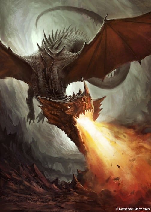
- Dragon’s Hoard, by Mortensen Games, Nathanael Mortensen

That’s right – you play the dragon in Dragon’s Hoard!
FINAL THOUGHTS
I just want to take a minute to acknowledge Luke Laurie for starting this interesting chat on mechanics and theme. I also want to say thanks to all our great commenters. It’s been fun to see all the remarks on Facebook, here on the blog and on BGG. Speaking of BGG, a reminder about our two geeklists with theme and mechanics:
Theme is More Important than Mechanics – on BGG
Mechanics are More Important than Theme – on BGG
I think a lot of folks are going to be happy with our third post in this series where Mark Major debunks it all and denies that it’s either theme or mechanics. I’ve seen many readers touch on this with a holistic mention of “experience,” “art forms,” “systems,” “concept,” “presentation,” and “inspiration”, to name a few.
Until then, I leave you with this fun comment about theme from Judd Vance, who as part of a Dice Tower you tube review on top Ameritrash games, gave this guideline for determining if you have a heavily themed masterpiece – it’s all in the description:

