There are many things I learned through the experience of having created my first Kickstarter project. I feel fortunate that it funded, and a great deal of my success I attribute to one factor.
In preparation for launching my page, I had read and re-read Jamey Stegmaier’s blogs, kept up with the Kickstarter Best Practices Facebook group, and I’d worked on my project page for about three months before it launched. To say there was one thing amidst all of my preparation and planning that made the difference between funding and not funding may seem narrowly focused, but I can’t see it any other way. Without this one thing, I am sure the page would have been confusing, less professional and less successful.
SO, WHAT IS THE ONE THING?
Outside feedback. The one thing I did, and will do even more of, the next time I run a project, is to seek outside feedback on the page itself.
You may have heard that putting your project out there for preview is a good marketing tool – building buzz for the project before it launches to hopefully build those day one numbers. But seeking outside feedback is about much more than just telling people your project exists before the launch date.
After three months of honing every word just the way I wanted it, fixing every graphic just the way I wanted it, and crafting every reward tier just the way I wanted them, I had a project page that catered to me. The problem with that is that I don’t have to sell my project to myself – I have to sell it to everyone else who visits my page. And there are a lot of people who just see things differently.
I can break down the groups of people who saw my page and provided helpful feedback into three categories:
- The Kickstarter Clueless
- The Kickstarter Veterans
- Marketing Professionals
—
1. THE KICKSTARTER CLUELESS
The Kickstarter Clueless people are the people who might go to Kickstarter for the first time just to back my project. They’ve never used the site before and are unfamiliar with how it works or what is expected. I knew that in my circles of influence, a lot of my backers would fall into this category, so I wanted to get previews to some of these people to make sure they’d understand it when others like them found the page. Among the previewers was my dad. He’s a great man, an awesome dad, but technically challenged. So, I asked him to look at the page and fill out a questionnaire. It included questions like:
What is the project raising money for?
What’s the main thing you remember after looking at the page?
Is anything particularly confusing?
What stands out visually?
What other information do you need to know?
…and other questions designed to gauge how well the page would work with the Kickstarter clueless.
Now, this group included the first people I asked to look at my page. I was too nervous to have people who actually knew what they were talking about critique my page. But, in hindsight, this group of Kickstarter clueless should have been some of the last people I talked to. Once I had things nailed down and more concrete – right before I sent the live campaign to them asking for pledge dollars – that is when they needed to look at it. At that point, they would have been more helpful looking at the page as I intended the public to see it. As it was, they were helpful in shedding light on early issues that were still being hashed out in later feedback sessions. But next time, I’ll wait for their feedback until the project can benefit the most from it.
2. THE KICKSTARTER VETERANS
The Kickstarter veterans are the people who use the site both as project creators and backers, or who back so many projects that it is second nature to them. I am fortunate enough to have the League fill that role for me. Their plethora of knowledge and feedback cannot be overstated. Through their engagement on some key issues in my page, I was able to more concretely decide what I needed to represent in the project and why.
It is key to note here that I did not do everything that every person suggested, but by the time the project launched, I knew why I had done what I did. I knew it because by seeing, listening to and reasoning with other people, my ideas were cemented in logic instead of just “‘cuz I want it that way…?”
I learned a lot from asking this group of veterans to preview my page. I learned that people actually will read all that text in the body of the page! Since I am one who mainly watches a video and then looks for the pledge levels, I hadn’t fully fleshed out the text. (What a nube).

I learned that the video is great to grab interest and introduce yourself and the project, but the page text is where information can get rich. My friends at this level of feedback were instrumental in helping me ensure that what I wanted to communicate was actually what I communicated.
My favorite backer reward even came out of this group of previewers; a custom etched martini glass with the game name and tagline was the idea of League member, Jeff Cornelius. I love it, and if I had kept the page to myself, backers would have lost out on the coolness, and I would have lost out on $400 or more of backer pledge dollars.
3. MARKETING PROFESSIONALS
This last category includes the last person who previewed my page. Her name is Lauren and I didn’t even ask her for feedback. In fact, I was so close to my launch date and so ready to go, when she started giving criticism, I was dismayed. Until I started listening.
Lauren has a professional background in web marketing – specifically in designing a webpage for product so that people will want to buy stuff off of it. Her suggestions were awesome. After all the other feedback helped me shape exactly what I wanted to say, she helped me shape what it should look like. There were some suggestions that it was just too late in the game for me to change, and so I’ll seek her expertise earlier in the page creation next time. But the few minor, yet effective, changes she suggested, took my page to the next level. And I loved it.
One such suggestion was this:
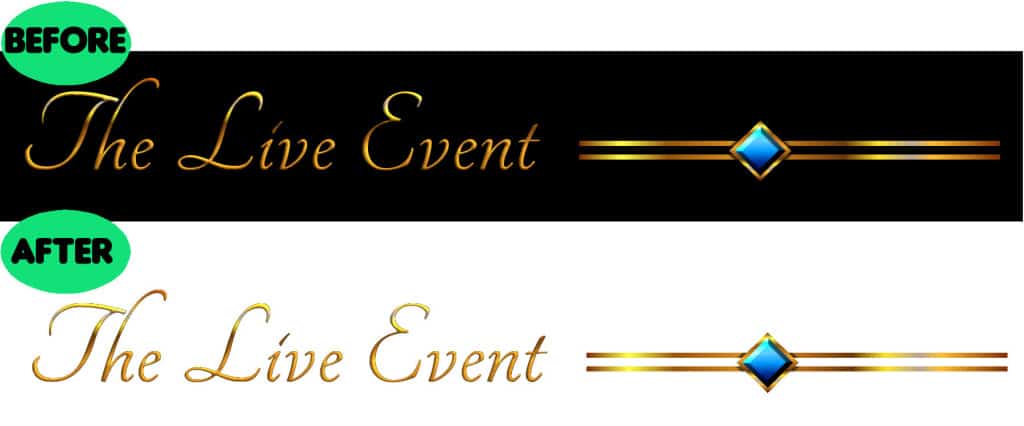
These are before and after examples of my header banners – to introduce a new section in the body of the page. I had a black banner on them, which I thought made it feel mysterious and dark – much why we went dark with our box front. However, Lauren suggested, I agreed, that the black boxes were less effective than a white background. The black acted as a speed bump to the eye as a reader scrolled through the page, and brought attention to the not-so-valuable header. I wanted people reading about the Live Event, not just reading the words “The Live Event.” This was one simple and effective change I made solely because an outside person looked at my page and made a helpful suggestion.
IN MY OPINION
It is this project creator’s personal opinion that keeping the page secret until you “unveil” it on launch day is only hurting your potential reach. There is no way that you can possibly see every aspect of your page from every angle on your first try. Look at the Kickstarter page you create as a first draft. Every professional writer will tell you that your first draft is never good enough for a finished product. You’ve worked so hard on your project, and probably run through many drafts of it and gotten feedback on it – so why not do your project page a favor and give the same level of care?
If you’re not part of a league, you can still get other creators and backers alike to preview your page. Maybe you don’t have access to a professional online marketing pro. But be not dismayed! The important thing is that you get your page in front of people and listen to their feedback.
ASK QUESTIONS, SEEK ANSWERS, PEOPLE ARE MORE WILLING TO HELP THAN YOU MIGHT THINK
Let them surprise you with their unique take on your project. Ultimately, the project is yours, and it must be something you are proud of and that represents you. You just may be surprised at how much better you can represent yourself and your project after hearing how other people see it.
So, how about you? Have you created a project and sought outside feedback? Have you ever previewed a page and helped keep someone from making a huge mistake? What advice do you look for when creating a campaign?


